Driving Japan
Overview
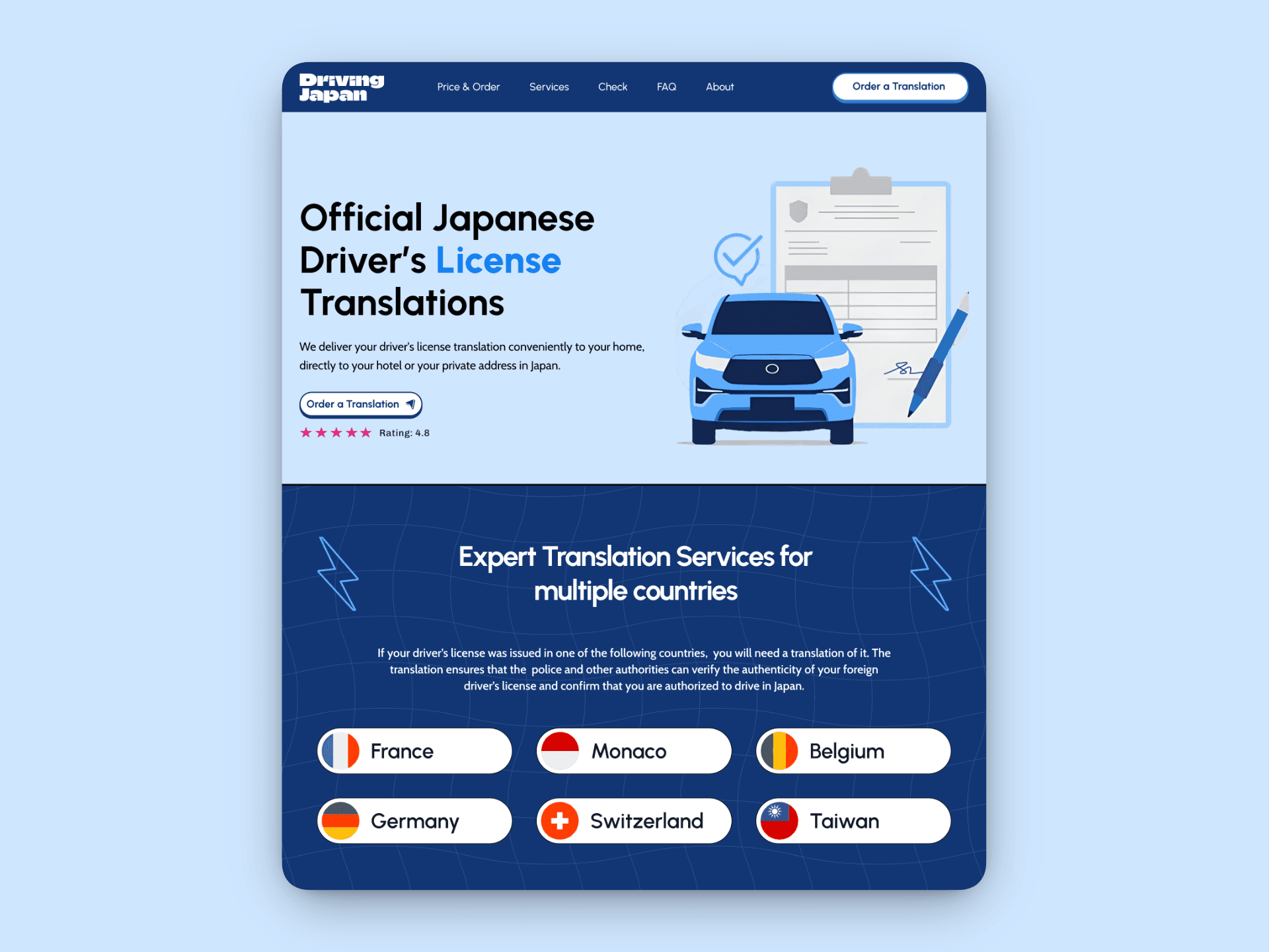
Driving Japan provides official driver's license translations for international travelers visiting Japan. A legal requirement for anyone from countries like Germany, France, Switzerland, Belgium, Monaco, and Taiwan who wants to rent a car.
Despite offering a valuable service backed by JAF (Japan Automobile Federation), the company needed a digital presence that could convert tourists in the critical window between booking their trip and arriving in Japan. The existing process was unclear, the service felt impersonal, and users dropped off before completing orders.
My role was to design and build a complete website that would educate visitors on the legal requirements, present multiple delivery options clearly, reduce decision paralysis, and guide users seamlessly from awareness to purchase, all within a 2-week timeline using Framer.
1000+ Customers Since 2019 | 6 Supported Countries | 3 Delivery Methods | 4.8★ Customer Rating
When complexity kills conversions
"Most travelers don't know they need a license translation until they're researching car rentals. By then, they're overwhelmed with logistics. We needed a site that could quickly build trust and make ordering feel effortless."
— Client Brief
The primary challenge wasn't technical, it was psychological. The target audience consists of travelers already managing flights, accommodations, itineraries, and now an unexpected legal hurdle which is license translation. The site had to instantly communicate credibility (this is an official, legitimate service), simplicity (the process won't add stress), and flexibility (multiple delivery options to fit different travel plans).
Building trust through clarity
I structured the design around three strategic pillars:
Instant Qualification: Visitors needed to immediately know if the service applied to them. Country flags with clear visual hierarchy appeared in the hero section, reducing confusion within seconds.
Linear User Journey: The entire site follows a single conversion path: awareness → education → decision → order. No distractions, no unnecessary navigation complexity.
Transparent Process: A 4-step visual timeline removes mystery from the ordering experience. Users see exactly what happens from upload to delivery.
From user research to live site
User Research & Journey Mapping
Interviewed past customers and analyzed drop-off points in the existing booking flow. Identified that users needed delivery option comparison earlier in the journey and clearer documentation requirements upfront.
Information Architecture
Structured content into a single-page scroll experience with strategic anchor navigation: Price & Order, Services Check (country eligibility), FAQ, and About sections. Minimized page count to reduce cognitive load.
Wire-framing & Content Strategy
Created low-fidelity wireframes focused on content hierarchy and conversion flow. Rewrote copy to be scannable, benefit-focused, and anxiety-reducing ("Fast, Easy & Safe" messaging throughout).
Visual Design & Component Library
Designed a clean, professional aesthetic with calming blues and whites to evoke trust and reliability. Built reusable Framer components: pricing cards, step indicators, country badges, and form elements.
Framer Development & Interactions
Implemented responsive layouts, smooth scroll animations, and micro-interactions. Added an order status checker integration and connected pricing cards to the order form with pre-filled delivery method selection.
Testing & Refinement
Conducted usability testing with 5 target users. Refined pricing card clarity (added delivery timeframes prominently), improved mobile navigation, and simplified the required documents checklist based on feedback.
Measurable improvements in engagement
The redesign delivered a conversion-optimized platform that has served over 1000 customers since launch. The clear information architecture and trust-building design patterns significantly reduced customer acquisition friction.
By consolidating the experience into a single, well-structured page with strategic navigation, users can quickly assess eligibility, understand the process, compare pricing, and place orders without confusion. The order tracking feature reduced support tickets, while the transparent pricing and delivery options addressed the #1 customer concern: "Will this arrive before my trip?"
Categories
Framer Website
UI UX Design
Date
Aug 8, 2025
Client
Driving Japan


Driving Japan
Overview
Driving Japan provides official driver's license translations for international travelers visiting Japan. A legal requirement for anyone from countries like Germany, France, Switzerland, Belgium, Monaco, and Taiwan who wants to rent a car.
Despite offering a valuable service backed by JAF (Japan Automobile Federation), the company needed a digital presence that could convert tourists in the critical window between booking their trip and arriving in Japan. The existing process was unclear, the service felt impersonal, and users dropped off before completing orders.
My role was to design and build a complete website that would educate visitors on the legal requirements, present multiple delivery options clearly, reduce decision paralysis, and guide users seamlessly from awareness to purchase, all within a 2-week timeline using Framer.
1000+ Customers Since 2019 | 6 Supported Countries | 3 Delivery Methods | 4.8★ Customer Rating
When complexity kills conversions
"Most travelers don't know they need a license translation until they're researching car rentals. By then, they're overwhelmed with logistics. We needed a site that could quickly build trust and make ordering feel effortless."
— Client Brief
The primary challenge wasn't technical, it was psychological. The target audience consists of travelers already managing flights, accommodations, itineraries, and now an unexpected legal hurdle which is license translation. The site had to instantly communicate credibility (this is an official, legitimate service), simplicity (the process won't add stress), and flexibility (multiple delivery options to fit different travel plans).
Building trust through clarity
I structured the design around three strategic pillars:
Instant Qualification: Visitors needed to immediately know if the service applied to them. Country flags with clear visual hierarchy appeared in the hero section, reducing confusion within seconds.
Linear User Journey: The entire site follows a single conversion path: awareness → education → decision → order. No distractions, no unnecessary navigation complexity.
Transparent Process: A 4-step visual timeline removes mystery from the ordering experience. Users see exactly what happens from upload to delivery.
From user research to live site
User Research & Journey Mapping
Interviewed past customers and analyzed drop-off points in the existing booking flow. Identified that users needed delivery option comparison earlier in the journey and clearer documentation requirements upfront.
Information Architecture
Structured content into a single-page scroll experience with strategic anchor navigation: Price & Order, Services Check (country eligibility), FAQ, and About sections. Minimized page count to reduce cognitive load.
Wire-framing & Content Strategy
Created low-fidelity wireframes focused on content hierarchy and conversion flow. Rewrote copy to be scannable, benefit-focused, and anxiety-reducing ("Fast, Easy & Safe" messaging throughout).
Visual Design & Component Library
Designed a clean, professional aesthetic with calming blues and whites to evoke trust and reliability. Built reusable Framer components: pricing cards, step indicators, country badges, and form elements.
Framer Development & Interactions
Implemented responsive layouts, smooth scroll animations, and micro-interactions. Added an order status checker integration and connected pricing cards to the order form with pre-filled delivery method selection.
Testing & Refinement
Conducted usability testing with 5 target users. Refined pricing card clarity (added delivery timeframes prominently), improved mobile navigation, and simplified the required documents checklist based on feedback.
Measurable improvements in engagement
The redesign delivered a conversion-optimized platform that has served over 1000 customers since launch. The clear information architecture and trust-building design patterns significantly reduced customer acquisition friction.
By consolidating the experience into a single, well-structured page with strategic navigation, users can quickly assess eligibility, understand the process, compare pricing, and place orders without confusion. The order tracking feature reduced support tickets, while the transparent pricing and delivery options addressed the #1 customer concern: "Will this arrive before my trip?"
Categories
Framer Website
UI UX Design
Date
Aug 8, 2025
Client
Driving Japan
Driving Japan
Overview
Driving Japan provides official driver's license translations for international travelers visiting Japan. A legal requirement for anyone from countries like Germany, France, Switzerland, Belgium, Monaco, and Taiwan who wants to rent a car.
Despite offering a valuable service backed by JAF (Japan Automobile Federation), the company needed a digital presence that could convert tourists in the critical window between booking their trip and arriving in Japan. The existing process was unclear, the service felt impersonal, and users dropped off before completing orders.
My role was to design and build a complete website that would educate visitors on the legal requirements, present multiple delivery options clearly, reduce decision paralysis, and guide users seamlessly from awareness to purchase, all within a 2-week timeline using Framer.
1000+ Customers Since 2019 | 6 Supported Countries | 3 Delivery Methods | 4.8★ Customer Rating
When complexity kills conversions
"Most travelers don't know they need a license translation until they're researching car rentals. By then, they're overwhelmed with logistics. We needed a site that could quickly build trust and make ordering feel effortless."
— Client Brief
The primary challenge wasn't technical, it was psychological. The target audience consists of travelers already managing flights, accommodations, itineraries, and now an unexpected legal hurdle which is license translation. The site had to instantly communicate credibility (this is an official, legitimate service), simplicity (the process won't add stress), and flexibility (multiple delivery options to fit different travel plans).
Building trust through clarity
I structured the design around three strategic pillars:
Instant Qualification: Visitors needed to immediately know if the service applied to them. Country flags with clear visual hierarchy appeared in the hero section, reducing confusion within seconds.
Linear User Journey: The entire site follows a single conversion path: awareness → education → decision → order. No distractions, no unnecessary navigation complexity.
Transparent Process: A 4-step visual timeline removes mystery from the ordering experience. Users see exactly what happens from upload to delivery.
From user research to live site
User Research & Journey Mapping
Interviewed past customers and analyzed drop-off points in the existing booking flow. Identified that users needed delivery option comparison earlier in the journey and clearer documentation requirements upfront.
Information Architecture
Structured content into a single-page scroll experience with strategic anchor navigation: Price & Order, Services Check (country eligibility), FAQ, and About sections. Minimized page count to reduce cognitive load.
Wire-framing & Content Strategy
Created low-fidelity wireframes focused on content hierarchy and conversion flow. Rewrote copy to be scannable, benefit-focused, and anxiety-reducing ("Fast, Easy & Safe" messaging throughout).
Visual Design & Component Library
Designed a clean, professional aesthetic with calming blues and whites to evoke trust and reliability. Built reusable Framer components: pricing cards, step indicators, country badges, and form elements.
Framer Development & Interactions
Implemented responsive layouts, smooth scroll animations, and micro-interactions. Added an order status checker integration and connected pricing cards to the order form with pre-filled delivery method selection.
Testing & Refinement
Conducted usability testing with 5 target users. Refined pricing card clarity (added delivery timeframes prominently), improved mobile navigation, and simplified the required documents checklist based on feedback.
Measurable improvements in engagement
The redesign delivered a conversion-optimized platform that has served over 1000 customers since launch. The clear information architecture and trust-building design patterns significantly reduced customer acquisition friction.
By consolidating the experience into a single, well-structured page with strategic navigation, users can quickly assess eligibility, understand the process, compare pricing, and place orders without confusion. The order tracking feature reduced support tickets, while the transparent pricing and delivery options addressed the #1 customer concern: "Will this arrive before my trip?"
Categories
Framer Website
UI UX Design
Date
Aug 8, 2025
Client
Driving Japan


Website & Product Designer
I discovered my love for web design and development pretty early on. Turning ideas into real, working websites quickly became something I couldn’t get enough of. Over the years, I’ve sharpened my skills and built a business focused on helping entrepreneurs and creatives bring their vision online with clarity, structure, and style.
Beyond just design, I’m passionate about how websites can tell stories, attract clients, and simplify how businesses operate. I understand how frustrating it can feel when your online presence doesn’t reflect the quality of your work and that’s where I come in.

Book a call, and I’ll take care of the rest
©Lorxel Ayo 2026. All rights reserved.
Website & Product Designer
I discovered my love for web design and development pretty early on. Turning ideas into real, working websites quickly became something I couldn’t get enough of. Over the years, I’ve sharpened my skills and built a business focused on helping entrepreneurs and creatives bring their vision online with clarity, structure, and style.
Beyond just design, I’m passionate about how websites can tell stories, attract clients, and simplify how businesses operate. I understand how frustrating it can feel when your online presence doesn’t reflect the quality of your work and that’s where I come in.
Book a call, and I’ll take care of the rest
©Lorxel Ayo 2026. All rights reserved.